When a user visits your website, you’ve got 8 seconds to grab their attention. Usually, the first thing that grabs their eye is whatever is at the top of the page. This area is known as “above the fold” and refers to the content that’s visible without having to scroll.
This blog will cover the basics to best practices as follows:
What Does “Above The Fold” Mean?
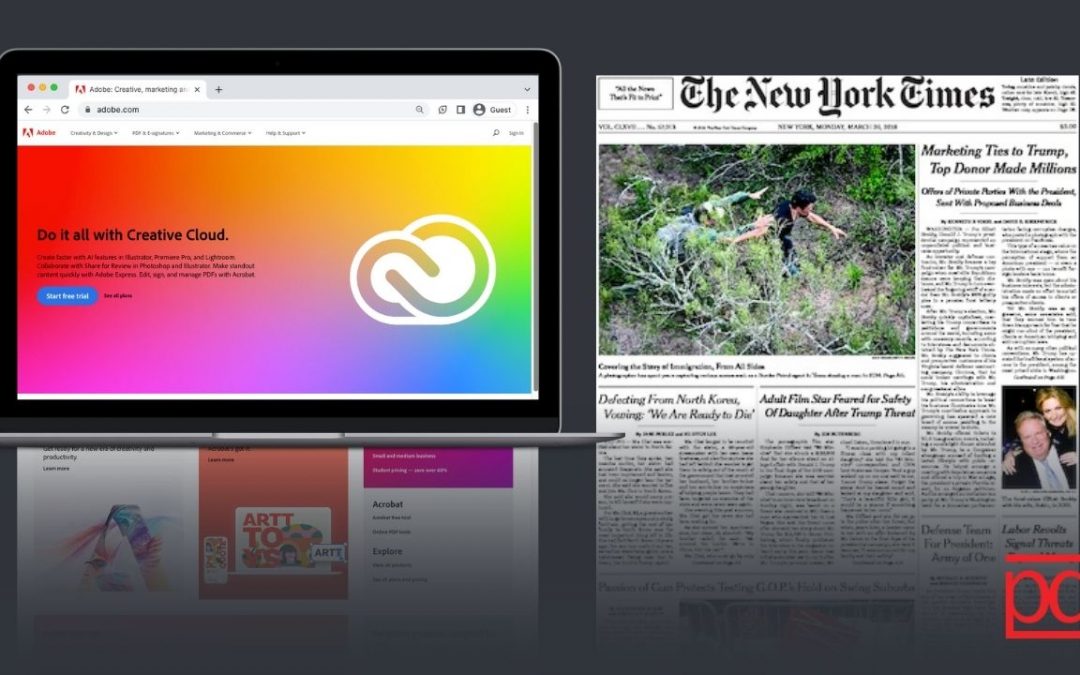
Above the fold, in print refers to the stories that were featured above the fold of the newspaper. In today’s digital world, this term has been adopted to websites. The principle remains the same. Anything that can be seen when someone first lands on your website without having to scroll is considered to be above the fold. More specifically speaking, the fold is approximately 1,000 pixels wide and 600 pixels tall at the top of the page. Having that basis of the exact dimension of the fold is important when it comes to design specifically and when you organize your page to determine what should be in this top spot.
Initial instinct may be to want to put everything above the fold, but be wary of this as it can overwhelm the user and cause them to not take any action at all! Instead, the general rule of thumb is to include internal links to other pages (also known as a navigation bar), to inform the user about the page’s content with imagery and a solid H1 header, and to invite the user to take ONE action (CTAs).
WOAH, woah, woah…. back up – what’s a navigation bar, headers, and CTAs? Let’s talk about the basics for each so you can build that foundational knowledge to bring it to your own website!
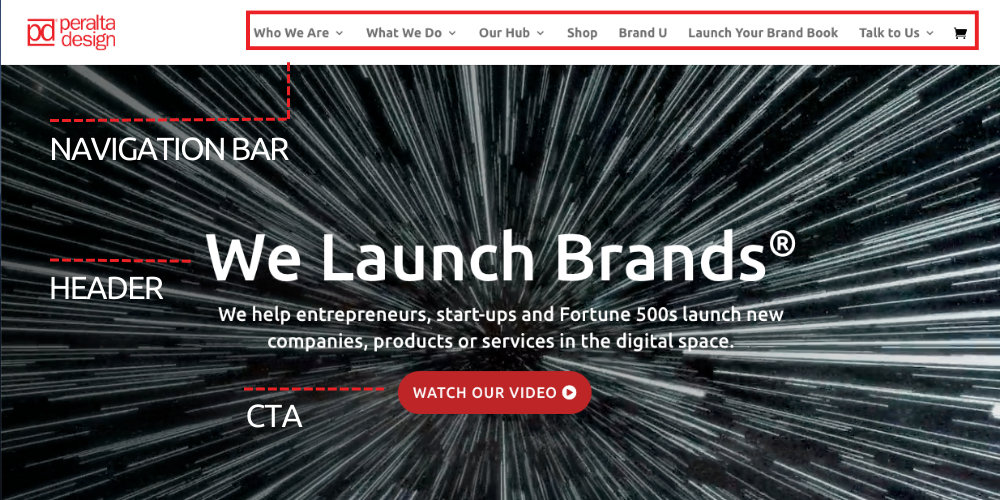
What Is A Navigation Bar?
The website navigation bar is a collection of useful links that allow visitors to find content and features on a site. There are several types of navigation bar set ups that you can choose from but we are going to focus on the intent or purpose rather than the layouts and design of them. The key is to have the most important information accessible to the user. These internal links will bring users to different pages where they can learn more.
Navigation bars ensure that the user experience is seamless. This bar, as the name suggests, makes the website easy to navigate. The most common pieces that are typically included in the navigation bar are About, Contact Us, Products/Services, Resources and any additional important page you would like to highlight. It’s important to not overfill the navigation bar, best practice is to have no more than 6 page links in this section of the page. These main navigation page links can also have submenus that direct you to other pages. For example: the services page can take you to an overview page of the services but this can also have a submenu of the different services available at your company. In order to use this space most effectively, think about your company and what you want to communicate to those who visit your website. Now that we’ve covered the navigation bar (the piece at the very top of the website) let’s shift our focus down the fold a little bit to the piece often referred to as your H1 header of the page.
What Is A H1 Header?
H1 header is an HTML tag (a snippet of code in website language that tells your browser how to display the content) that indicates a title on a website. There are six different heading tags that your website can have H1, H2, and so on. These tags are often formatted from largest (most important) to smallest (least important). Of these, the H1 is considered the most important and is critical for SEO because Search Engines look at your H1 tags in order to learn about the page contents, which is why the more descriptive the H1 the better. Additionally, if this header shows your website visitor that the page they are on matches their search intent, they are less likely to bounce back to their search and click on competitors’ links for that information.
Whether you’re building your website or creating a blog post to generate new content, there are a few rules to the header’s that you must keep in mind:
- There should only be one H1 tag on your page
- Your H1 should describe the topic of your page
- Your H1 should be between 20-70 characters
- Answer user intent with your H1 – why are they on this certain website page? Why did they open your blog post/article?
Now that you’ve got your navigation bar determined and your page header settled, it’s time to think of what actions you want your users to take. These are typically the next steps you want your audience or reader to take.
What Are Call-To-Actions (Or CTAs)?
We are going to keep it high level for now as there is a lot to get into for CTAs. They are a simple and effective way to generate conversions and boost sales – they encourage the visitor to take action rather than read and leave your website. CTAs, especially above the fold, need to be targeted and strategic.
While placing CTAs above the fold is a best practice, you should be selective as to which ones you use. While an effective CTA can be a great asset, the wrong one could have negative consequences, such as causing people to leave your website due to confusion or due to overselling. Above all else, the CTA needs to align with the content on the page. What this means is that if we are on the home page the CTA will be different from someone who is hitting a landing page off of an advertisement. Why? Because it depends on where in the marketing funnel the users are. The way you communicate and the action you’d like your user to take differ depending on if they are first being introduced to the brand versus if they are already considering your product/service as an option. Tailoring your CTAs to these stages will help increase your click through rate as it will more successfully make your user take action.
Having these aspects above the fold and executed correctly can directly impact your engagement metrics and increase your conversions.
So now you have a basic understanding of the components that are showing above the fold, let’s talk about some best practices and how to optimize it. For this, we are going to focus on home pages and landing pages rather than blogs as the content pieces (ex CTAs) shift slightly for blogs.
Best Practices And Optimizations
First things first, don’t try to put everything above the fold. The idea is to put your best content, the content that will capture your users attention up top. Use an enticing image or clever copy and remove additional distractions to keep people scrolling and keep them on your webpage longer.
We may sound like a broken record at this point, but consistency is important and this remains true for above the fold content! It is important to have your logo on the left side of the navigation bar so that it’s easily visible for the user. Your brand colors, fonts, and design should be emulated, making it easily recognizable and distinct to your brand. Above all else, your above the fold should entice your audience into wanting more.
Finally, use your data. Look at the analytics you should have set up (GA4 is a free business tool every website should have to help you make informed decisions. For more information on how to use this tool check out our blog on data driven decisions.). This data will help you analyze your website to a new caliber, you can see what browsers, screens or device types are most commonly used to view your website or landing pages – this will understanding will help you make informed decisions on how to set up your fold and to ensure that it looks the way you expect on that screen size/format. You can also utilize this data to see metrics such as scroll depth, engagement rate and more that you can use as baseline metrics. To fully optimize the fold you can also A/B test it which means running two iterations of a landing page with the same advertisement to see which has more of an impact on your audience. Be sure to only change one key piece per test so you can actually note what made the difference.Whichever way we design our web pages, there’s a critical component we cannot disregard in today’s world where everyone has a mini computer in their pocket, yes we mean phones. Ensuring your website is mobile friendly is crucial because as of 2023 about 60% of all web traffic comes from people using mobile devices (please note this does depend per industry and your audience!). This shows the importance of having a responsive design for your website to ensure that if someone is looking at it on mobile can still see the critical pieces of information. The general concept remains the same – placing important content at the top, however layout may change slightly on the smaller screens.
Here’s A Quick Summary (TLDR):
- The content that users can see without having to scroll is above the fold.
- Above the fold should include:
- internal links to other pages (also known as a navigation bar)
- imagery and a solid H1 header that entices the user
- A call-to-action that (as it sounds) invites the user to take an action.
- This content should be consistent with your brand both in copy, imagery, font and color.
- Utilize data to ensure this section is optimized
- Make sure that it is mobile friendly as a large percentage of web traffic comes from mobile devices.