Case Study: Daktori, The Physician’s Financial Advocate
There are times during the startup process where companies switch gears from a branding and marketing perspective. A company may find that as it develops and prepares to launch, the process of defining itself through its messaging also manifests itself in the form of a constantly evolving visual identity.
Such was the case with Daktori, a Dallas-based startup that had already spent a considerable amount of time developing its brand story and brand identity. In fact, when we were first approached to take over the reigns of its branding initiatives, they were well on their way with establishing a ‘look & feel’ across their collateral.
The Evolution of a Brand
Allstate has the “good hands” and Prudential has the “rock”. Geico has the “Gecko”. Daktori’s metaphor was the ‘Giraffe.’ We actually thought the Giraffe was a great metaphor and loved how the brand story supported the visual. It wasn’t gratuitous; it had meaning. The elegance, grace and ability to see ‘above the fray’ and ‘above the crowd’ made the Giraffe a great symbol for Daktori and its goal of helping doctors navigate the complicated world of financial planning and streamlining their business processes.
Here’s a line direct from their brand story elaborating on the Giraffe concept:
“… the giraffe can offer higher ground for our vision, and lend us intuitive insight when we feel we’re blinded by life’s distractions. Call upon the giraffe when you are in need of a higher position with which to analyze the foggy terrain of your life. Also call upon the gentle nature of the giraffe to help you with gracefulness in action, patience, and sturdy footing in life’s potentially rocky terrain.”
Here’s some additional information on the Giraffe Spirit Meaning, Totem and Symbolism:
https://alltotems.com/giraffe-spirit-meaning-totem-and-symbolism/
Suffice it to say, we weren’t going to change that symbol, but instead, we sought to improve it.
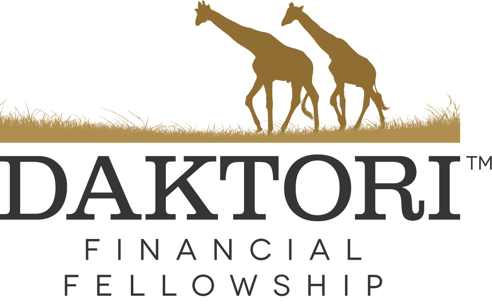
Here’s what their original Logo looked like:
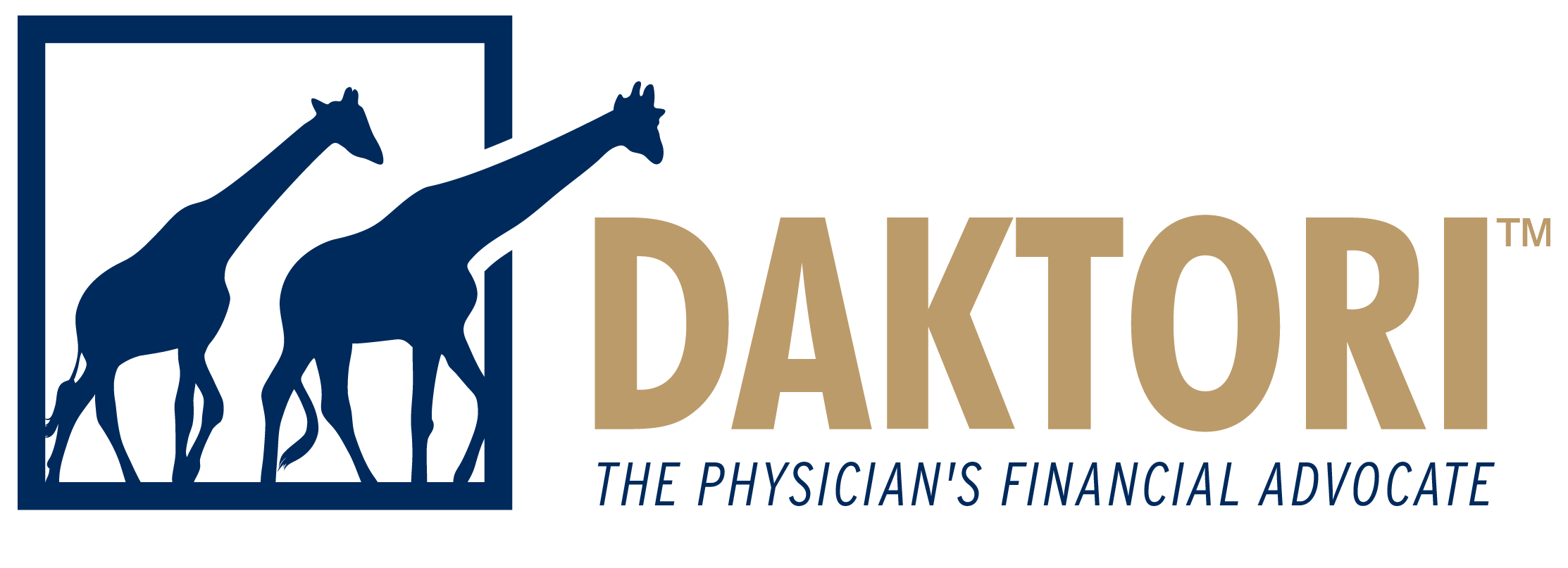
My first reaction was that the giraffes were going ‘backward’. The low-hanging fruit here was to flip the giraffes so that they were at least moving in a FORWARD re: Positive direction. Your logo should evoke a positive message, especially if you are in the market of improvement, vision and progress.
Here’s what it looked like when we flipped the giraffes:
![]()
We also added a tagline: “Looking Ahead… For You” in an effort to give the metaphor some context. The client really liked our initial feedback and direction and gave us free reign to continue with a full re-brand. The reason that this is an ‘evolution’ is because we don’t want to change the company name or metaphor, we simply want to improve it and help it make a more targeted impact upon launch.
The founders of this company wanted to brand themselves as Financial Planners and Financial Advisors to Doctors yet their marketing and branding was too heavily skewed towards the Giraffe/Safari metaphor. My next recommendations were to experiment with a different color palette, create a proprietary ‘bug’ or icon for a logo, lose the ‘grass’, which would be difficult to reproduce on a variety of media, and to move more towards the ‘Financial’ side of branding. Less safari, more wall street was the overarching theme in my thinking.
Over a period of a few months, the rebranding process began taking shape. We are currently developing variations of their logo, creating marketing collateral and building a web presence for them. Daktori is planning for a June 2013 company launch to coincide with the launch of their new website.
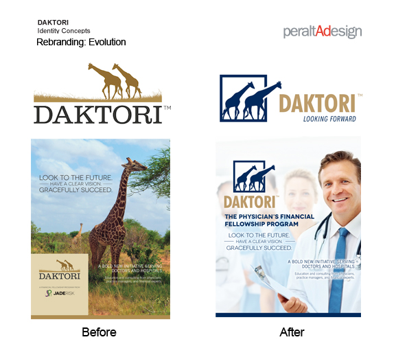
Before & After
Below is a “Before & After” illustration of where we netted with their brand identity as compared to where they were when they first approached us and engaged us as their agency of record for creative services. They are very happy and we are too. Let us know what you think!
Ramon has over 20 years of experience in award-winning, market-proven, print collateral, marketing material, iphone/ipad app and website design specializing in corporate identity and branding. Ramon’s passion for entrepreneurial design was borne out of 10 years as Creative Director for Jay Walker at Walker Digital, the Stamford based idea laboratory and business incubator holding over 300 US Patents. Ramon served as Senior Art Director on the start-up launch team behind Priceline.com, a Walker company and invention. Most recently, Ramon’s logo and identity work was selected to be published in “Typography and Enclosures” the fourth book in the Master Library series by LogoLounge.
Need help with your brand identity or want to overhaul your existing brand? Contact: ramon@peraltadesign.com
Follow Ramon on Twitter @Peralta_Design
Follow Ramon on Instagram @peraltadesign
Find us on Facebook at https://www.facebook.com/peraltadesign