This year’s Presidential election has to be one of the most divisive and fundamentally polarizing contests in a long time. Whether its Black vs White, Rich vs Poor, Democratic vs Republican, Liberal vs. Conservative, you can clearly see a distinct difference in each candidate’s target audience – at least from a marketing strategy perspective that is. Their backstories go something like this: President Obama has lived the American Dream, raised by a single-mother, worked his way up the ranks to become President working to help the middle-class and the underserved. Romney by contrast, born into wealth, keeps off-shore bank accounts and questionable tax records and earned a paltry $20 million last year looks to help big business and wants to tax the poor to help the rich (allegedly).
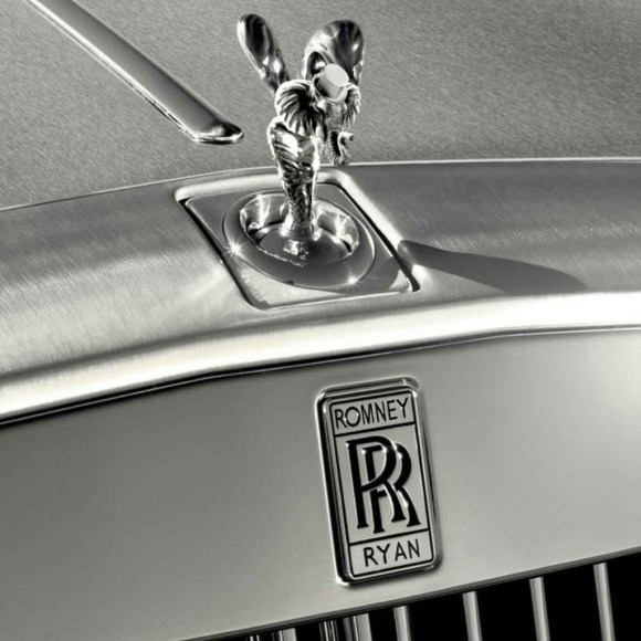
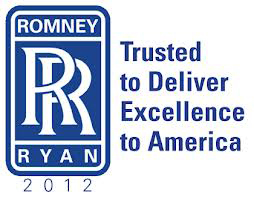
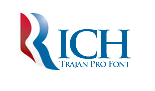
Without getting too much into the Politics of it all – this is after all a DESIGN and entrepreneurship blog, I couldn’t help but notice the Romney campaign logo, especially since he recently announced that his running mate would be Paul Ryan. Right away, from a graphical perspective, you can see the RR (Rolls Royce) image popping up on various blog sites:
Trajan Pro vs Gotham
Jokes aside, I wanted to take a look at the font choice: Trajan Pro.
Anyone that is familiar with my firm’s work, knows that we love Trajan Pro. We use it often because it’s a great Display (headline) font for anything that is upscale or elegant. In the case of the Romney campaign logo, does the use of Trajan Pro caters to their upscale, higher tax-bracket, wealthy audience?
Typekit by Adobe describes Trajan Pro as such:
“The inscription on the base of the Trajan column in Rome is an example of classic Roman letterforms, which reached their peak of refinement in the first century A.D. It is believed that the letters were first written with a brush, then carved into the stone. These forms provided the basis for this Adobe Originals typeface designed by Carol Twombly in 1989. Trajan is an elegant typeface well-suited for display work. “
Trajan Pro just looks ‘Elegant and Wealthy’ doesn’t it? You fancy, huh?
Gotham for the People
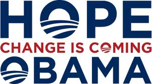
Take a look at the Obama/Biden campaign logo from 2008
The Obama “O” logo was designed by Chicago-based design agency Sender LLC’s Sol Sender. They actually created more than just a logo, they created an identity which began with the “O” and creating a ‘rising sun’ to symbolize a new day. According to Sender, The power of the logo a lot to do with the “power of the candidate’s’message”
The particular campaign logo above uses the serif font Perpetua, which is fancy, but later on it was changed to Gotham, a sans-serif font designed by Tobias Frere-Jones in 2000.

We use Gotham at our firm all the time. Its clean, its simple, its strong. It doesn’t have the regal, rich, wealthy baggage that comes along with the elegant Trajan Pro because its just here to get the job done. It reaches the masses. Gotham, like the city that shares its name, should be for the people! (Channeling the character “Bane” from Dark Knight Rises)
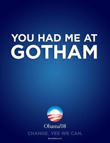
Gotham as a font is supposed to evoke a sense of common, every day, non-ethnic and understated sophistication. According to Jones, “its not the kind of letter a type designer would make. It’s the kind of letter an engineer would make.” Its no frills, it’s shown here in this Obama ’08 campaign slogan:
Here’s a funny poster I found in a Google image search using Gotham:
And even more Gotham:
And here is the new 2012 Obama Campaign Logo:
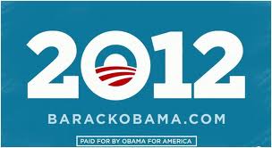
Alice Twemlow, chair, MFA Design Criticism Department (that’s an actual department lol) says this about the 2012 Obama Campaign logo:
“Sol Sender’s design for the 2008 Obama campaign reset the standards for campaign logo design. His iteration for the 2012 re-election is less revolutionary but no less sophisticated. The sun rising over the American fields emblem, which the campaign presumes is now so recognizable that this is all is needed to signify the president, has taken up residence in the 0 of 2012. The choice to reverse the text in white out of cornflower blue feels fresh and bright, and still hopeful. The typographers Hoefler & Frere-Jones created a custom slab version of Gothic [Gotham] with serifs for the 2012 campaign and so the numerals are made of blockier bolder stuff than they were in 2008. Let’s just hope the man is too.
Well – maybe I’m the only one paying attention to which font each candidate uses, but I find it fascinating that the fonts used in this Presidential race, so appropriately reflect the candidate’s message. Romney’s choice of font speaks to the rich and Obama’s choice of font speaks to the middle class.
So who will you vote for in this election, the elegant and wealthy ‘Trajan Pro’, or the common, font of the people, ‘Gotham’?
You can answer that in Comic Sans please.
Resources:
https://blog.sva.edu/2012/02/steven-heller-debbie-millman-and-alice-twemlow-on-the-2012-campaign-logos/
https://en.wikipedia.org/wiki/Trajan_(typeface)
https://en.wikipedia.org/wiki/Gotham_(typeface)
https://anexconsview.wordpress.com
———————————————————————————–
Ramon has over 19 years of experience in award-winning, market-proven, print collateral, marketing material, iphone/ipad app and website design specializing in corporate identity and branding. Ramon’s passion for entrepreneurial design was borne out of 10 years as Creative Director for Jay Walker at Walker Digital, the Stamford based idea laboratory and business incubator holding over 300 US Patents. Ramon served as Senior Art Director on the start-up launch team behind Priceline.com, a Walker company and invention. Most recently, Ramon’s logo and identity work was selected to be published in “Typography and Enclosures” the fourth book in the Master Library series by LogoLounge.
Need help with your brand identity or want to overhaul your existing brand? Contact:ramon@peraltadesign.com
Follow Ramon on Twitter @Peralta_Design

