
Opinions are like Rebrands – everybody has one… and they often stink!
As per usual after any major brand does a full rebrand, the internet wakes up and everyone is a logo expert.
The MSNBC (MS NOW) Rebrand:
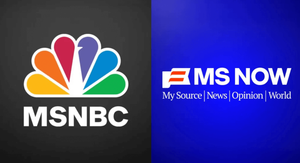
In this case, MSNBC rebranded to MS NOW and the ridicule has been nonstop ever since. This is often due to the fact that people are not taking any brand history into consideration. They are simply looking at aesthetics, but when it comes to logos and branding, there is always more than meets the eye.
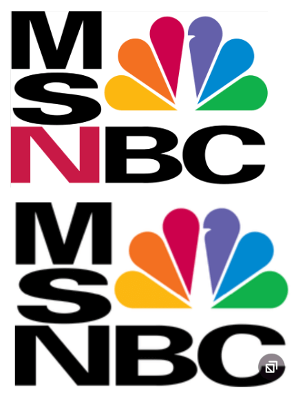
MSNBC goes back to when Microsoft and NBC merged to form what would become a very “left-leaning’ news network and this is what the original logo looked like back in 1996 – 2000 when it was first formed – notice the red “n” which was subsequently removed when Microsoft sold off it’s shares to NBC (and then the “n” became black).
What prompted the name change and logo rebrand?
Well in this case, MSNBC is no longer affiliated with NBC, in fact it is in direct competition with it. It is now owned by Versant, a separate company that will no longer be able to rely on NBC as a news source. They wanted no ‘bread crumb trails’ and it appears to have been hasty as the announcement only came recently, August 18, 2025 to be exact.
Here are my Top 5 reasons this rebrand is getting so much hate:
- There is too much ‘equity’ in MS as an illness
- There is too much ‘equity’ in MS as Microsoft (and there is no affiliation with Microsoft)
- When it comes to logos, if you have to explain it, it ain’t good (tagline breaks down the acronym so that its dummy proof)
- The only ‘bread crumb’ trail to the old logo is the font and it wasn’t a distinct one anyway, so should have done a complete rebrand (new name as well)
- It’s lazy, uninspired and a missed opportunity
Can we expect to see a much more inspired iteration of the brand in the near future? One can only hope.
The Cracker Barrel Rebrand
“Hey Charlie, remove the cracker and the barrel please!” Cracker Barrel cleans up their brand in a new rebrand that has folks hungry for comments!
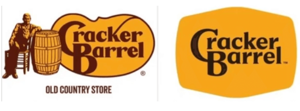
The Cracker Barrel rebrand is getting a different type of clapback from fans of the popular southern breakfast spot. It has drawn ire from both people that have had less than pleasant experiences with the food chain as well as those who loved the old branding, especially the MAGA crowd who are really up in arms over this rebrand; going as far as accusing the chain of going ‘woke’ for removing their beloved redneck character from the brand identity.
It is a known fact that even though Cracker Barrel had more than 450 restaurants across 41 states, many of the incidents supporting a pattern of racial discrimination took place in the South. There was a lawsuit that led to a federal investigation by the Department of Justice (DOJ)– the only instance of intervention in a racial discrimination case under the George W. Bush administration. The DOJ found evidence that Cracker Barrel did, indeed, engage in racial discrimination across 50 restaurants in seven Southern states. The investigation revealed that managers often directed and participated in racist treatment of customers.
Let’s discuss the rebrand:
That being said, I believe what drove this particular rebrand is an effort to attract a younger demographic as the dining competition heats up (remember Ruby Tuesday’s and Friday’s?) and this logo rebrand is part of a much larger effort that includes remodeling the inside of the restaurants as well.
The old logo featured a seated man known as the “old timer” and while we are living during a political season that seeks to roll back time and downplay “just how bad” slavery was, we can all agree that the first step toward being more inclusive can be removing any indication of who the restaurant is for from the logo. I think what is getting folks upset is that its losing its ‘charm’ or traditional look. I visited one location down south and remember it having a country store right inside the restaurant which was a cool feature. It sold period or vintage type home decor so that patrons could bring some of that down home country feel back home.
Back to the logo – I think it’s wise to remove the “old timer” from the branding, especially considering how according to Wikipedia, “ Cracker, sometimes cracka or white cracker, is a racial slur directed at white people, used especially with regard to poor rural whites in the Southern United States.”
From a practical perspective, we continue to see a trend toward ‘debranding’ where logos are getting simpler and cleaner. Removing the ‘old timer’ and the barrel from the logo makes it much easier to reproduce and easier to identify in smaller sizes that brand identities are often relegated to when used on tablets, phones, and other small screen sizes.
My advice for rebrands:
As you can see by the comments on social media, rebrands are often met with vitriol and criticism, but my advice would be to do a little background research as to why there was a rebrand to begin with. Oftentimes understanding the strategy behind it all, will help the redesign make just a little more sense.
As far as finding more things to be upset about, I think we can all agree that we have bigger fish to fry. Getting upset over logos on social media is energy that can be better spent on more important issues.
Sources:
https://logos.fandom.com/wiki/MSNBC
https://www.usatoday.com/story/entertainment/tv/2025/08/18/msnnbc-name-change-msnow/85707508007/
https://variety.com/2025/tv/news/msnbc-new-name-ms-now-1236491621/
https://apnews.com/article/cracker-barrel-new-logo-rebrand-efforts-67f3181a144cd639eb33d1066f85ef08