You don’t have to possess advanced graphic design skills to craft stunning visuals for your brand. Utilizing user-friendly platforms like Canva, you can design social media graphics, blog post headers, and even videos that not only exude visual appeal but also seamlessly align with your brand identity. Canva can be overwhelming due to the sheer amount of options it provides. In this blog we will cover what Canva is, what the templates are, how to use them, best practices to keep in mind when using them and the 10 great templates for business owners to use. Let’s get into it!
What is Canva?
Canva is a powerful graphic design tool that has been gaining popularity as it is a user-friendly platform that provides users with a wide variety of tools to create professional looking visuals for the businesses or school projects.
Canva offers both a free and a paid (pro) option for users to select from. The Pro version unlocks a variety of new features as well as access to additional templates, graphics, audios and more.
Templates – what are they? Why to use? How to use?
Canva has thousands of templates which makes it a bit overwhelming, but that’s why we’ve created this blog post – to help alleviate some stress of selecting the right one. Let’s back up and cover what they are, why you should use them and how to use them.
What are Canva templates?
Canva Templates are branded content designs that can be modified; they are a blueprint that anyone can use to create graphics or documents for your brand more easily.
Types of templates available on Canva:
- Brochures
- Logos
- A4 documents and letterheads
- Posters
- Social media posts including Instagram, Twitter, and Facebook posts
- Flyers
- Cards and invitations
- Presentations
- Menus
Why should you use Canva templates?
Utilizing templates is a great way to produce great content that aligns with your brand in an easy, streamlined, cost effective way. In the best case scenario, your business will have a designer on staff who can create custom graphics for all your marketing collateral. However, realistically unless you are outsourcing your marketing or are a design company yourself, it’s less likely that you will have someone on staff with this particular skill set. If that’s the case, there are several sources available to you now that allow you to still create amazing graphics by following a simple set of guidelines.
How to use Canva Templates:
-
Keep it simple
Selecting templates can be overwhelming. It’s also tempting to choose templates that just look “pretty”, but it’s important when choosing your templates that you find ones that align with your current branding. Avoid choosing templates that are busy with design elements. And make sure, if there are any design elements, that they match your branding.
-
Use your brand fonts
Change the fonts in the templates to match your brand fonts. This will provide a more cohesive look to all the marketing collateral that you have. If you don’t your brand fonts are unavailable, you can upload your fonts with Canva Pro. We highly suggest using your brand fonts for all graphic design work to ensure consistency. Don’t have any cohesive brand guidelines set up yet? – Let us help!
-
Use your brand colors
You should never just use the templates as they are, instead, you should ensure that you updated them to match your brand. Your color palette should be carried through all templates you use.
-
Update imagery
You can either upload pictures you have of your business or products or you can search through the stock photos that Canva has available. Depending on your subscription level the amount available to you may vary – for example if you have Canva Pro you will have more options.
-
Adjust typography
When you input your information into the template, make sure to give it a look over and see if you need to make any adjustments. You might have to make the size of certain headers and body copy smaller if the amount of text you added is more than the template was made for. However, as you make adjustments be sure to not change the layout of the template too much as you might lose the design aesthetic.
-
Download & Share
Once you’ve adjusted the graphic as needed, you can simply click on the Share button and download the graphic for use in your platform of choice, or Canva also has the option to order prints of your graphic.
Top 10 Canva Templates for Businesses
So, let’s break it down to the top 10 Canva templates for businesses to use.
Services Social Media Post:
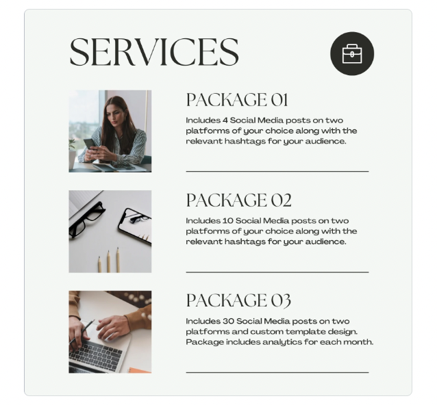
This template is great to use to showcase the different services/products you provide. It can then be pinned at the top of your social accounts so anyone who visits the page can easily see what your business provides. Remember that you can edit the headers to match what your business offers. If you don’t offer packages, update each header to a specific service or product. You can also update the briefcase icon to a branded icon, or something that aligns more with your brand (ie. if you are a therapist, change it to a heart or handshake to represent care). Additionally, you can replace the icon with your logo if it fits there. Click here to use this template.
Testimonial Social Media Post
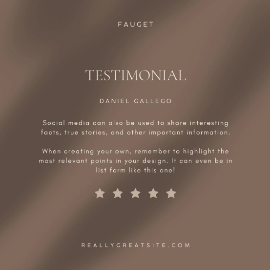
Testimonials are a great way to build trust. Highlighting happy customers/clients can spread the love and convince others to take the plunge and convert. If the texture in the background does not match your brand, remove it and just use a flat color used in your branding. But remember, whatever you use in the background needs to work in contrast with the text on top. Avoid using a busy background when you have text on top. Click here to use this template.
Educational Carousel:
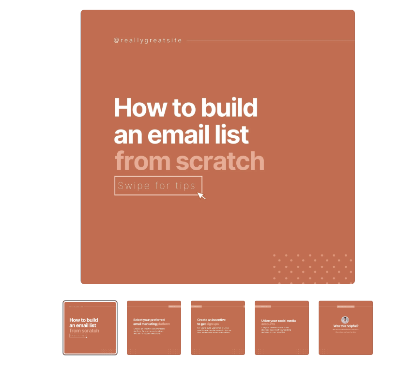
Educational content builds your platform as an expert in the field. You can educate your visitors on various industry topics to help build their knowledge and provide value. Providing value rather than focusing solely on selling your business/products will encourage users to follow you as they receive more than just promotional content. Click here to use this template.
Social Media Story:
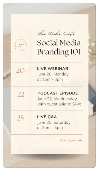
Stories on Instagram & Facebooks are a great way to remind your followers what you currently have going on. Other than sharing videos and photos of what your business has been up to, it’s also a great place to share upcoming events! This template includes space for 3 upcoming events. There is a lot of room for customization here. You can update it to “This Month’s Events”. You can delete the bottom two spaces for events and only promote one event. And don’t forget to change the background photo to something that aligns with the type of event you are hosting! Click here to use this template.
Facebook Cover Image:
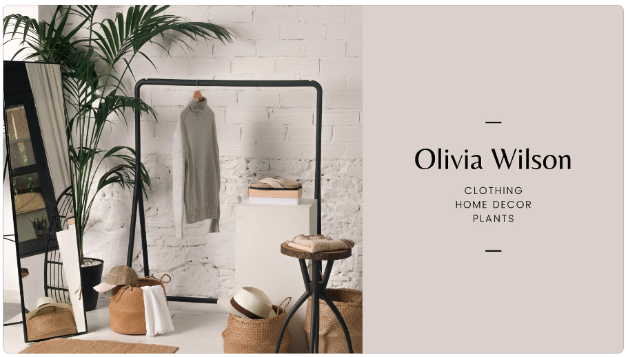
Facebook cover images are great pieces of real estate that, if used right, can quickly tell your viewers what your business is or what current promotions you have going on. It’s important to check where the image will be cut off or cover when you upload it to facebook, that way no important information is lost. This layout it perfect for listing your business name and services or even for promoting a special deal you have going on. It’s simple, yet effective! Click here to use this template.
Brochure:
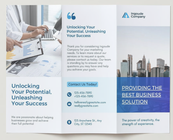
Brochures can pack a lot of information of what your business has to offer on one double-sided sheet of paper. But they can often be daunting to put together. This simple template makes it really easy with each section clearly defined. All you have to do is update it with company photos (or on-brand stock photos), change the fonts and colors to match yours, and then update the text with relevant information about your business! Just remember not to overload your brochure with too much information and stick to only what is necessary! Click here to use this template.
General Flyer:
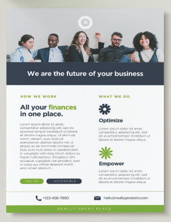
This is a great flyer that can be used to inform people of what your business is all about. The format is super simple and easy to use. You can even add fun branded icons that visualize what you offer. Click here to use this template.
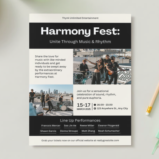
Event Flyer:
This event flyer is simple yet, has enough room for all the important details to let people know about your upcoming events. Though the flyer is made with music events in mind, the bottom portion of the flyer could be a great section to add more event details or even a QR code! Click here to use this template.
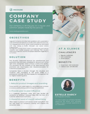
Case Study One Pager:
Case studies can be really effective because they provide a concise and visually appealing summary of a successful project or customer experience. This template is simple and has a great layout that really allows you to add a decent amount of information. Click here to use this template.
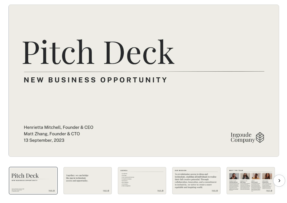
Pitch Deck Presentation:
Pitch decks are great visual aids that can help you win over potential clients or partners. But you aren’t going to win over anyone with a mediocre looking presentation. This minimal presentation template is perfect and very professional in style. It even includes a couple of editable graphs and infographics. Choose the slides you want to use, update them with your information, colors, fonts, and logo – and get ready to wow your audience! Click here to use this template.

