Making decisions for your business on data is a must – if you are just following your gut, you are not making informed decisions that will help your business grow. There are so many different places to obtain data in today’s digital world from Analytics on almost all platforms to market research and beyond – data is key.
Since we already covered the importance of data in a previous blog (read here if you missed it), let’s discuss Data Visualization.
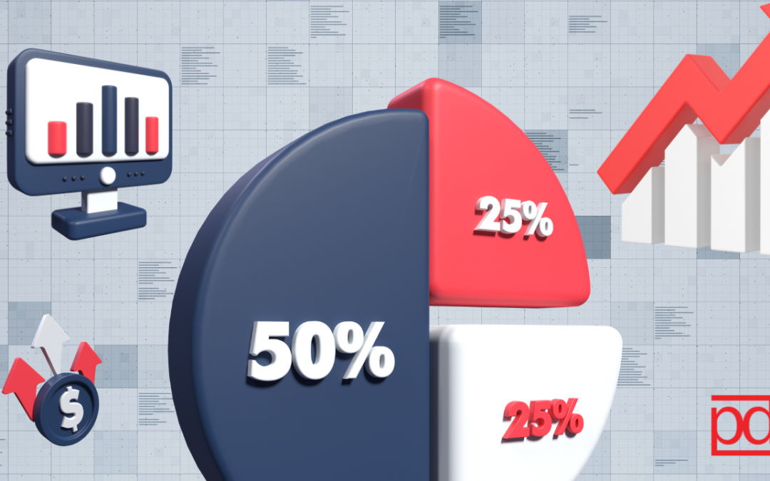
What is data visualization?
Data visualization is a powerful tool that when used correctly, can have a big impact.
- Enhances Understanding: visualizing data via charts, graphs and diagrams to make complex information more accessible and easier to understand. This allows both experts and non-experts to grasp the insights quickly and effectively. Visual information is often more memorable than raw data. People are more likely to remember key insights presented in a visually appealing and engaging way.
- Identifies patterns and trends: visualization can help uncover patterns and trends or correlations within the data that aren’t as noticeable when looking at raw numbers or text. Data visualization can quickly highlight outliers and anomalies within datasets, helping to identify errors, anomalies, or unusual patterns that may require further investigation.
- Supports Decision-Making & Increases Engagement: Data visualizations can captivate an audience and hold their attention, making data more engaging and encouraging individuals to explore and interact with the information. Presenting data in a visual format can make it easy for decision-makers to make informed choices based on a clear and concise representation of information.
Now that we’ve discussed not only what data visualization is but also why it’s important, let’s talk about some best practices you can implement for your next presentation.
Best Practices
- Define a clear purpose – What are the priorities in terms of what you want to communicate? Only present important information that your audience can use and act upon
- Know your audience – Know how familiar they are with the information you’re exposing them to to understand how to best visualize it and how to present it.
- Keep it simple – Less is more, you want your visualizations to be as digestible as possible – get rid of unnecessary information without distorting it
- Avoid distorting data – Present findings as accurately as possible, avoid “tricks” that bias how your data is perceived or interpreted, use labels for scaling etc.
- Ensure your visualizations are inclusive – Think about colors, contrast, font size and use of white space to ensure its readability
In summary, data visualization is not merely a means of presenting data; it is a powerful vehicle for understanding, interpreting, and communicating complex information. To make the most of data visualization, it is essential to adhere to best practices. Choosing the right visualization techniques, ensuring data accuracy, and considering the needs of your audience are key principles to follow. By doing so, you can harness the true potential of your data, leading to more informed decision-making, deeper insights, and enhanced communication. So, dive into the world of data visualization, and watch your data come to life in ways that are both enlightening and impactful.