The big names in Social Media have been anything but quiet in the past few months, from with the big “X” logo rebrand to the launch of Threads. There’ve been continuous changes brought upon us – some for the better and some still to be determined.
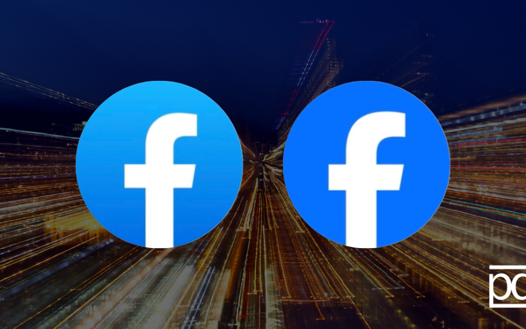
One of the “for the better” cases is Facebook’s refresh. Honestly, it’s so subtle that you may have even missed it entirely. Those with keen eyes may have noticed that the iconic lowercase f was tweaked a little bit and the surrounding shade of blue darked and became more vibrant.
Let’s back up for a minute, what is a brand refresh?
A brand refresh is typically a small step taken in response to customer feedback, design trends, the industry, or internal changes. In Facebook’s case it’s more a design trend along with the industry having a heavier emphasis on accessibility. These changes can take on a variety of forms such as slight differences in: color palette, tone of voice, logo redesign, or simply promoting values from a new angle. If you want to learn more about brand refreshes check out our rebranding vs brand refresh blog. Otherwise, let’s dive into what changed for Facebook!
What changed in Facebook’s refresh?
The ‘f’ and shade of blue are not the only things that Facebook changed, but instead you will now find an expanded color palette that has also been optimized for accessibility. While blue remains the foundation color, there are now more tones across secondary blues that offer the platform more options in their collateral.
The logo and colors aren’t the only thing that got a refresh, Facebook also gave some attention to the Reactions as they are now an essential piece of Facebook’s User-Experience (UX). The change that reactions saw, was similarly subtle, as it mainly focused on ensuring that they were more legible at smaller sizes. Additionally, they adjusted the color range of the reactions to express more emotion.
Why did Facebook do this refresh?
Well, Facebook kept accessibility at the forefront of their mind for this one. The deeper hue has greater contrast against the ‘F’ to help with visual accessibility in the app. It’s also been adjusted slightly to make it a flattened mark. What does that mean exactly? A flat logo design is one that is two-dimensional, simple and silhouette driven. It is often designed without highlights, shadows or intricate details. We’ve seen this trend amongst several big brand names such as Google and even Instagram as they shifted from their 3D textured logo to a minimalist two-dimensional logo.
What even is accessibility in design?
Accessibility in design describes how many people can use the interface. This usually involves designing for people with various types of disabilities, such as vision, hearing, mobility, cognitive, etc. Color is just one of the ways that this can be achieved. If you’re curious about accessibility and ADA compliance click here to read more!
In addition to accessibility, Facebook stated that they wanted the refresh to feel familiar yet dynamic, bolder and polished. Dave Nguyen the Design Director at Meta stated that “these subtle, but significant changes allowed us to achieve optical balance with a sense of forward movement.