It’s no secret that brands change and evolve over time. If your brand has been around for a few years now, there is a good chance that it is not the same as when it was launched and neither are your customers. As your brand grows, it is important to ensure that your company’s brand identity still reflects your company and attracts your ideal customers.
At a glance, the terms “Rebrand” and “Brand Refresh” appear to be interchangeable. However, it’s important to note that there are key differences to consider when thinking about which term you are using, especially if you’re thinking about engaging someone else in the execution. So, what’re the main differences between the two?
In this blog we will discuss:
Rebrand
This is typically a drastic change in how a brand looks or presents itself. Typically, this would be formally announced as it serves as a milestone in a company’s timeline. This is often times accompanied with a new logo and marketing collateral updates. An easy way to think of a rebrand is to consider it not only as a reset on your company but as a way to relaunch yourself into a new market or be viewed differently. Typically, this is not done frequently as you can easily alienate the target audience you fostered previously when rebranding – this type of change is often due to a relaunch campaign or a big reveal. It typically leaves brands with a love it or leave it reaction with their existing base.
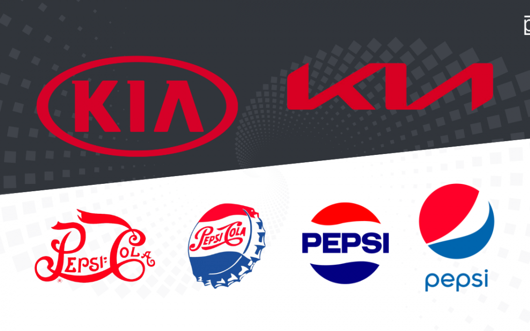
Here are two examples of recent full rebrands: KIA and HBOMax
KIA
KIA is a tried and true brand that was well known for being an economical and reliable Korean car manufacturer. They wanted to shift their brand perception from being known for producing ‘cheap’ cars to being known for pioneering electric vehicle technology. They would not have benefited from a refresh because it would not have been a drastic enough change. The drastic change of not only shedding their previous brand perception, but of creating an entirely new one, required a drastic change to their branding. Hence, the new brand identity which for many, reads as “KN” not KIA. They are definitely no longer the ‘cheap’ or affordable brand they used to be, with the Stinger and the Telluride, KIA vehicles are now upwards of $60K price points. Currently there are two electric KIA models available with fourteen (14!) more on the way.
![]()
HBOMax
By now, you’ve seen the new MAX brand on your favorite smart TV or at least heard some of the backlash consumers have expressed in their uproar over HBO dropping their vintage moniker for the cleaner and leaner MAX branding. You would be hard pressed to find someone who is happy that their beloved HBO is no more. Most of us grew up watching the iconic opening logo animation sequence for HBO and have come to know and love HBO for its adult-oriented programs with iconic shows such as Game of Thrones and OZ or more recently, Last of Us. So why would someone drop such an iconic acronym (which stands for Home Box Office)? It is precisely because they want to break from their stereotypical ‘adult / male’ oriented programming reputation that they worked so hard to build up over the years.
HBO recently acquired Discovery+ which skews more female, and offers shows like 90-Day Fiancé, and they felt they needed to rebrand into something more ‘gender and age neutral’. We don’t think they rebranded because most people referred to them as “MAX” but rather because they wanted to do a full reset on their brand. This could not have been an easy decision to make, and one that we’ll dive deeper into in a future blog post. What is interesting to see, is that despite doing a full rebrand on their mark by dropping the HBO name (kind of like Nike dropping their swoosh) you do see that there is a definitive “breadcrumb” to their old mark: the “O” circle has migrated from the “O” in HBO to the “A” in MAX. Pretty clever way to retain a connection while doing a full rebrand. We’re big fans of breadcrumbs, especially with brands that have a long history.
![]()
Brand Refresh (also known as a Brand Evolution)
A brand refresh on the other hand, is more common as it is a small step taken in response to customer feedback, design trends, the industry, or internal changes. A refresh helps your brand stay current without a big undertaking. These changes can take on a variety of forms such as slight differences in: color palette, tone of voice, logo redesign, or simply promoting values from a new angle.
As these changes are slight yet noticeable, you may be wondering how do you know if it’s time for a brand refresh (or brand evolution)?
- If your logo does not translate well into the digital environment
The internet has adjusted the world of branding, and some logos are just not suited for the format needed on the website. For example, if your logo is super detailed or too long it may not fit well in a banner ad, homepage or even social icon – showcasing that it may be time for an update so that you do not miss out on this critical real estate. - If your brand is no longer communicating effectively with your audience
One of the biggest signs of needing a brand refresh is if you are noticing inconsistencies in brand messaging. If your logo is behind the times compared to your customer base/products or if it does not match where your company is headed, it may be a great time for a refresh to ensure that you’re setting your business up for success with the next steps you are taking. Everything ties back to truly understanding your audience, identifying them and being sure you’re talking to them directly. For assistance on how to recognize your audience and create what is known as a user persona in marketing check out our blog. - If your brand is having you fall behind the competition
You need to ensure that your entire brand identity allows you to play against the competition. For example, if you do not have a color palette that aligns with your brand identity or if you do not have any brand style guidelines at all – it’s time to do a brand refresh to ensure that you maintain brand consistency to continue to build that trust with your audience.
Brand Refresh Examples
Now that we understand the potential reasons behind a brand refresh, let’s dive into some examples starting from a big name brand that has been in the public eye for years to our own brand refresh.
Example 1: Pepsi
Over the years Pepsi has had several brand evolutions throughout their lifespan. The first brand refresh took the brand from a font that was typical at the time to a bolder, more readable modernized font that worked well in packaging such as the paper wrapped around bottles and the bottle caps. The second shift occurred in 1950 where it switched to a more striking image visually that in turn also looked better on TV, advertising and packaging. This brand refresh also dropped the Cola portion of its name from branding making it easier for users to remember. In 1987, Pepsi adjusted their logo yet again, evolving the design into a circular symbol that still signifies the bottle cap but allows them to expand further.
In 1998, Pepsi shifted towards a 3D logo, while having the blue become the primary color of the design. The 2008 refresh streamlined the logo further with adjusting the fonts again to reflect a modern minimalistic feel. By adjusting the logo to fewer symmetrical waves, they believed it rejuvenated the logo and provided a more youthful and vibrant feel to their brand. The latest brand refresh that was made on Pepsi’s 125 anniversary, returned Pepsi back towards the older version of their logo that utilized the bold typefaces cradled within the iconic red and blue circle. Pepsi stated that this adjustment was made as this refresh has the ability to stand out and appeal more in the digital world by allowing them to introduce more movement and animation to the design.
![]()
Example 2: PD Refresh
Peralta Design has been through several brand refreshes since our inception. The original PD ‘square’ icon dates back to the late 90’s when it was an acronym for the official corporate name of the company that was registered as a corporation: Peralta Illustration & Design. When it was a part-time business, the really long nomenclature really didn’t matter too much because the checks were far and few in between. Email and ‘beeper’ messages was the main contact protocol. It was also more cost effective before the advent of digital printing to go with black & white printing, hence the color palette was monochromatic. However in 2008, Ramon was laid off and forced to venture out on his own full time. It was then that two things happened: he needed more brand awareness (needed to make a splash) and needed to update his website. The domain for the website was ‘peraltadesign.com’ and the more he saw it spelled out, the more he saw the word “Ad” in the name (short for advertising).
It was also during this 2009-2011 phase that he began to incorporate the color red. The red evolved from all of the marketing collateral and assets I had from my first big brand launch during his final days at Walker. He had all of the creative assets to the Station Casinos brand. Imagine how hard a casino has to stand out amongst the crowd in Vegas. PMS 185 Red became my goto color. The word “Ad” in the logo gave way to yet another brand refresh, which was the dreaded “Capital A” years which amounted to stacking the logo and breaking up the word to reveal a capital A. Thank God this phase was short-lived. In 2012, we developed the famous PD icon, which paid homage to the original square logo, but also gave us an icon that could be used on social media. Eventually we dropped the capital A because it was competing for attention against the PD icon and that brings us up to our modern day brand which is now a registered trademark. You can see the ‘breadcrumb’ trails (the name, the color, and the font) which survived through all of the brand refreshes which helped us maintain brand recognition. To read about the full PD Brand Story check out Launch Your Brand.
![]()
What now?
While both brand refreshes and rebrands can be scary as you can’t be sure of how your audience will respond, if it is done correctly and at the right time you are likely to be met with support for the adjustments you make. Ideally, you will reap the benefits of getting on everyone’s radar again, or raising brand awareness with your target audience. It can also, when done right, improve morale with your team and employees as well. It should always be done strategically, intentionally, and sparingly. Otherwise, you run the risk of losing people with each variation.
If you’re not sure what to do with your branding or need help in deciding whether a full rebrand or just a refresh is what you need, have no fear, we’ve got you covered. Connect with us here.