Brand Consistency creates TRUST. How? Through predictability. The more consistent your brand is, the more recognizable it is to your customers. A brand that is predictable and reliable provides a feeling of sincerity and trust. A brand is not just a logo. The logo however, is the very first piece of a brand. It should be reflected clearly and consistently on all marketing materials such as business cards, brochures, websites, letterhead, social media, presentations, flyers, etc. For optimum trust factor, that branded collateral should ALL remain consistent throughout.
“Good design and consistency equals brand recognition, brand recognition equals trust and trust equals success.” – Launch Your Brand, Ramon Peralta
Benefits of Brand Consistency:
- Supports a positive initial interaction between new users and the product
- Ensures information is balanced and easily consumed
- Results in less confusion and a more seamless experience
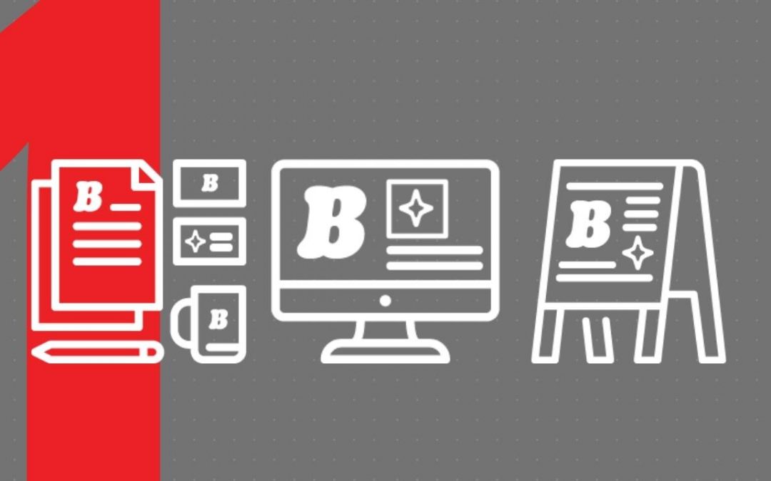
- Creates a strong brand image throughout all visuals (ex. websites, applications, social media, printed materials, etc.)
- Creates brand recognition
In today’s article, we will get into the importance of Design Consistency.
Design consistency is a main pillar when it comes to Brand Identity. Why is this important? Jakob Neilson, one of the leading world experts on Web usability, explains that “Consistency is one of the most powerful usability principles: when things always behave the same, users don’t have to worry about what will happen.”
A Checklist for Design Consistency:
- Color: A set corporate color palette used across all marketing collateral
- Your brand colors reflect the essence of your brand’s voice and tone. Is your brand friendly, inviting and energetic? Then consider using a yellow or orange. Or do you want to convey a feeling of trust, reliability and security? Then go with a shade of blue. Understanding the Psychology of Colors when deciding on your palette will help reinforce your brand’s personality.
- Typography: A set font or font pairings is used across all platforms and collateral.
- The font you’ve chosen should also reflect your brand’s personality and characteristics. Ask yourself: Is your business “modern” and “sophisticated” or “fun” and “whimsical”? For a more detailed explanation on how to choose a font for your brand, check out this MasterClass article!
- Hierarchy: A set of rules for arranging and emphasizing elements by their relevance.
- Visual hierarchy is used to rank design elements in the order you want your users to view them. Important elements should be bigger than less important ones.
- The typography used across your brand should follow a consistent scale when organizing content. Using a typographic scale tool is helpful when it comes to ensuring the visual hierarchy is consistent.
- Grid: A grid system is in use for all content across your brand.
- Whether it’s your website or a printed flyer, a grid system should be used to allow for a clean and orderly arrangement of all components. Using a grid system helps align content based on columns and rows. Establishing this creates unity between all elements and in turn, creates a smooth visual flow for the user.
How to maintain Design Consistency?
Okay, now you know all of the aspects within your brand that need to be consistent. But how do you make sure it stays this way once implemented? One tool that will become your savior when it comes to brand consistency is Brand Guidelines. Brand guidelines are a clear set of rules and standards that take the guesswork out of designing brand assets.
Brand Guidelines should cover all aspects of the company’s brand identity, this includes:
- Logos: full logos, secondary logos, and icons
- Don’t forget to include the “Do’s and Dont’s” when it comes to the usage of your logos.
- Color palette: primary colors, secondary colors, and color combinations. These colors should be coded for use in print or on the web with the appropriate PMS, CMYK, RGB, and HEX values.
- Pro-tip: Name your primary color. Ex. “Netflix Red” or “Spotify Green”
- Typography: font styles, sizes, and spacing
- Other imagery: photos, illustrations, and artwork
- Voice and tone: how the brand uses language and emotion
Design consistency is key when it comes to creating brand consistency. A consistent visual experience fosters security and reliability in the user experience. But the visual experience is not the only important part of brand consistency. As mentioned in the list above, the brand voice and tone is another key element to creating a reliable and successful brand and it should also be consistent along with your visual content. Stay tuned to find out how you can establish even more consistency throughout your brand through voice and tone.
You can learn more about brand consistency and other important branding tips in Ramon Peralta’s new book, Launch Your Brand. Available soon.