Why Color Choice Matters
One of the most important steps in launching your brand is establishing what your corporate color palette will be. We see far too many entrepreneurs take their brand matters into their own hands thinking that it is something that they can do themselves. If there’s one area that can really make an impact with your target audience it’s your branding. Most people know that your logo is very important and that it should follow best practices with regards to legibility and simplicity of the mark. It should also be something that is proprietary to you and not clip art. A good logo should be something you can legally protect with a trademark. That being said, the color palette you choose for your business brand will impact every single aspect of your brand identity. It will affect everything from your business card to the sign on your building. If you look at the most successful franchise businesses out there, you can witness strong brand guidelines at work. What you may not be aware of is what kind of non-verbal communication you are making with your color palette. Ask yourself: does it align with what your company does, or more importantly how does it make your target audience feel?
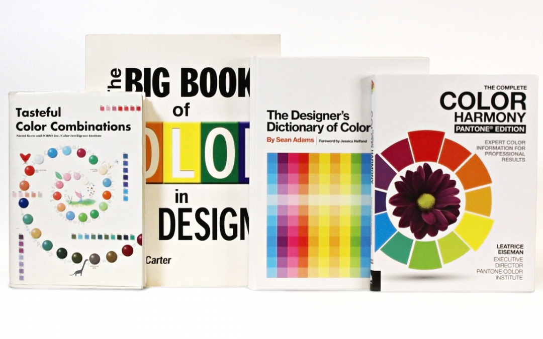
There are a plethora of books on the market that deal with the subject of color psychology and we keep many of them on hand in our studio as it helps us determine which color studies we should present to a client once we’ve settled on a (black and white) logo design. The Color Intelligence Institute produces one of our favorites called “Tasteful Color Combinations” and we also favor “The Complete Color Harmony Pantone Edition” by Leatrice Eiseman, the Executive Director of the Pantone Color Institute. Color is serious business. The last thing you want to do is to choose your favorite color as your brand color if it doesn’t align or evoke the feelings that you want to evoke with your business. Yes, you can use colors to evoke feelings. Real feelings. There is real scientific data that supports the theory that colors impact human behavior.
Check out these colors and see if you notice the association when you think of your favorite brands:
Blues and Greens = Trust, Reliability, Serenity
Industries = Financial Institutions, Banks, Law Enforcement Agency
Example: most recently we saw a masterclass on color theory take place when M&T Bank (Green) completed their acquisition of People’s United Bank (Blue). The collateral and communication and even their brick and mortar locations went through a phase out process of introducing M&T Bank’s green into the blue People’s locations and for a while, all of their materials had both Blue & Green (and both logos) and then ultimately, the blue was completely gone. It was very well done, and kept existing customers happy with the familiar while introducing the new.
Reds and Oranges = Excitement, Energy, Increased Appetite, Attention
Industries – Gyms/Fitness Centers, Restaurants, Creative Agencies
Example: In very crowded markets, using a bright color like red can really get people’s attention. We know that there’s a reason why stop signs and traffic lights are red – they stop us in our tracks. Reds & Oranges can be very invigorating colors (think of how we love staring at a fire pit) that you see used at fitness centers like Orange Theory or The Edge. We use a very strong version of red PMS (Pantone Matching System) 185 here at PD for our branding and if you’ve ever visited our offices, you know that it makes for a very good, high energy creative environment.
Purple = Royalty, High End, Luxury, Wise
Industries: Greeting Cards, Chocolates, Mattress Companies
Example: Purple has often been associated with royalty and luxury and by extension wisdom and quality. You see big brands like Cadbury Chocolates, Hallmark Greetings and Purple Mattress Company differentiating themselves amongst their competition by taking a visual ‘high road’ with their brand color of choice.
Yellow = Energy, Warmth, Happiness (Sunshine)
Industries = Furniture, Fuel, Automotive, Telecommunications, Restaurants
Example: Yellow is a great complimentary color and in some cases main color across a variety of industries because it is a ‘feel good’ color. You’ll often see it used in restaurants as it evokes foods such as lemons, corn, peppers, french fries, etc. but you also see brands like Shell Oil or Best Buy, or even Hertz use it for the reason that it is bright, bold and very optimistic. Be careful using it in typography, as it can be a bit hard to read against a light background.
Whether you are in the process of branding your company, or just want to be more keenly aware of the intention behind some of your favorite brands’ corporate color palette, understanding how color makes people feel is a key element in understanding the power of branding. Of course, you must also take note of how consistent the most successful brands are in utilizing their company color palettes in uniforms, vehicles, websites and print materials.
As you go deeper into the science of color theory, you will also begin to appreciate how complementary colors, or those colors that are opposite of each other on the color wheel, create a vibrancy between themselves that can be used to create energy. A good example of that is the color palette of blue and orange, which are very popular complimentary colors that you see often in sports teams such as the NY Knicks and the NY Mets. By contrast, the use of a more monochromatic corporate palette might be seen in government offices or municipal buildings where the tone is less promotional and more practical. Even then one could argue that the color palette of the town itself should be carried over into all municipal buildings for brand consistency.
Questions to ponder as you approach the world with a newfound interest in brand color theory:
Is the brand “Chic and Mature” or is it “Technical and Mechanical?” Is it “Healthy and Fresh” or “Academic and Noble?” At the end of the day, we do see color and color in branding does matter because they make us feel a certain way (which is often intentional)! For additional resources on color theory and the variety of colors out there, and how they can improve your brand, please visit the Pantone Color Institute at Pantone.com as they also offer guidance on trends and are the definitive authority on color in the graphics industry. Their PMS color matching system ensures brand consistency no matter what part of the world is printing or displaying your collateral.