Your website may look polished, modern, and visually appealing but if your message isn’t landing, your visitors won’t stick around long enough to admire the design.
Think of your website like a salesperson. No matter how stylish they look, if they can’t clearly communicate what they offer, how it solves your customer’s problem, or why you’re different, no sale. That’s the reality of messaging on the web: visuals attract, but words convert.
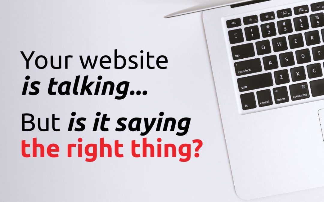
So ask yourself: Is your website really saying what your audience needs to hear?
Why Messaging Matters Just As Much as Design
When someone lands on your homepage, you have just a few seconds to grab their attention. That initial headline, subheading, and call to action will either pull them in or push them away. Great messaging helps people instantly understand:
- Who you are
- What you do
- Why they should care
- What they should do next
Without that clarity, even the most beautiful website becomes a leaky bucket – drawing people in, but letting them leave without action.
Signs Your Website Messaging Is Missing the Mark
Let’s break down some of the common red flags:
1. Your Headline Is Vague or Generic
Does your site open with something like “Welcome to Our Website” or “We’re Here to Help”? While friendly, it says nothing about what you actually do or offer.
Fix it: Use clear, benefit-driven headlines that speak to your customer’s pain points.
Example: “Helping Nonprofits Build Brands That Inspire Action.”
2. You’re Talking Too Much About Yourself
“We’ve been in business for 25 years…” is fine—just not the first thing a visitor needs to hear. Your audience is thinking, What’s in it for me?
Fix it: Focus your copy on how you help them. Position your services as solutions to their problems.
3. There’s No Clear Next Step
If your call to action is buried or worse, missing entirely – users are left guessing what to do. Don’t assume they’ll figure it out.
Fix it: Make your CTA direct and visible. Use action verbs like “Start Your Project,” “Schedule a Call,” or “Explore Our Work.”
How to Craft Messaging That Works
If you’re ready to level up your website copy, here’s where to start:
Start With Your Audience, Not Yourself
Before you write a single word, revisit your ideal customer. What are they struggling with? What language do they use? Your messaging should sound like a conversation they’re already having.
Use the Problem-Solution Value Framework
This simple structure helps you focus your message:
- Problem: Identify the issue they’re facing
- Solution: Explain how you solve it
- Value: Show what’s possible if they work with you
Example: “Nonprofits often struggle to stand out. Our branding process clarifies your message and elevates your mission—so you attract more donors and make a bigger impact.”
Write for Skimmers
Use short paragraphs, bullet points, and subheadings to make your copy easy to scan. Avoid jargon, and aim for clarity over cleverness.
Add Social Proof Where It Counts
Your message becomes more believable when others back it up. Feature client quotes, project results, or recognizable logos near your key CTAs.
A Simple Test You Can Try Today
Ask someone who isn’t familiar with your business to look at your homepage for 10 seconds. Then close the page and ask them:
- What do we do?
- Who do we help?
- What should you do next?
If they can’t answer those three questions, your messaging needs refinement.
Final Thought: Design Sets the Tone, But Words Seal the Deal
Yes, your site’s visual design creates the first impression but it’s your words that close the gap between interest and action. Think of your homepage as your elevator pitch: it should be clear, concise, and customer-focused.
If you’re unsure whether your site is communicating the right message, we can help. From refining headlines to crafting brand voice guidelines, our team makes sure your visuals and your words work together to grow your business.