Italian automaker Lamborghini has always been synonymous with the quintessential supercar and it’s brand represents speed, technology and opulence. With aggressive body lines, bright colors and a futuristic stance, this dream ride continues to be a head-turner for young and old alike.
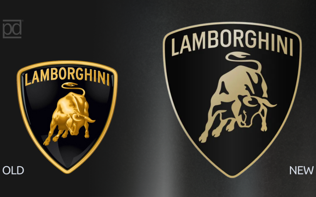
It has recently gone through a rebrand with a much needed update, but can you tell the difference? It has been over 20 years since the signature Lamborghini ‘bull’ has been updated but there are many reasons why you should also consider updating and refreshing your own brand as well.
The old logo
If we look back at logo design in the late 90s and early 2000’s we will see that designers were really having fun with shadows and bevels. Everything, both in print and online, had a “3D” effect. Designers far and wide had joyfully embraced all the bells and whistles that Photoshop had to offer such as the drop shadow tool and the bevel (inner and outer!) tools. Web 2.0 came out and changed all of that and designers started trending toward a flatter look for buttons and other calls to action design elements. This was particularly inspired by Microsoft Windows’ new UI which featured large blocks of solid color. As touchscreen technology evolved on tablets and phones, the need to make buttons look like real life buttons began to fade away. Instead a cleaner, simpler user interface became synonymous with good design aesthetics.
The new logo
If you take a closer look at the Lamborghini logo on the left, you will notice that the late 90s’ version featured a bull that was not unlike the trademark Wall St. bull statue, complete with shadows and gradients giving it a very 3D lifelike appearance on the branding. If you look at the newer updated version, you’ll see that all of that ‘feathering’ and ‘shadowing’ is gone. It is much flatter, simpler, and cleaner. Even the typography is thinner and cleaner in the newer logo. This isn’t what we would call a complete rebrand, but rather a brand refresh.
Why is simpler always better?
We recommend staying away from the bevels and gradients when designing your logo for your business not just because it is more aesthetically pleasing to be cleaner and simpler, but for real-life practical applications. Proper branding needs to be consistent and in today’s marketplace and digital landscape your logo may find it challenging to be consistent if it is too detailed and difficult to reproduce across a variety of media; both online and in print.
When you have a clean brand, you can rest assured that it will reproduce consistently, and maintain its integrity as a design that is clearly recognizable no matter what medium it is being reproduced on. Some examples of the variety of applications that your logo needs to reproduce well on include:
- Embroidery (1 color and multi-color)
- Screenprinting (T-shirts, promotional items, swag)
- Engraving (metal, glass, wood)
- Decals and Vinyl (cut vinyl letters and die cut stickers)
- Digital applications (social media, web favicons and profile pictures)
A good logo tells a story and the Lamborghini brand refresh is no exception. This new brand refresh reflects that the company is moving toward developing their own all-electric vehicle as well as joining the automotive industry trend of sustainability and social responsibility, specifically decarbonization. Social responsibility is something that today’s consumer has also come to expect from the brands that they support and remain loyal to.
We’re seeing many major companies ‘debrand’ or simplify their brand identities, some going as far as reducing their brands to simple acronyms. We’ve seen that happen with Weight Watchers which is now simply WW and Price Waterhouse Cooper which is now PWC. Even Willis Tower Watson recently debranded to just WTW.
But why do we continue to see poorly designed brand identities hit the marketplace?
The answer is simple: technology has advanced to the point where DIY culture is thriving in areas where the expertise is being replaced by AI, software tutorials and free apps. Some business owners in particular, have taken it upon themselves to create their own branding in an effort to save costs on hiring a designer. Some use crowd-design services or overseas talent that are often self-taught or not aware of the principles of good design, but have mastered the software nonetheless. My advice to business owners that are serious about creating a brand for themselves or their business is to ‘fire yourself’ and put your best effort in making the best first impression possible when launching your brand by hiring a professional.
For a full history of the Lamborghini brand: https://www.brandcrowd.com/blog/lamborghini-logo-history/
Photo credit and reference:
https://static.dezeen.com/uploads/2024/04/lamborghini-rebrand_dezeen_2364_col_0.jpg
To hire Ramon to speak visit: www.ramonperalta.com
To order your own copy of Launch Your Brand, visit www.launchyourbrandbook.com