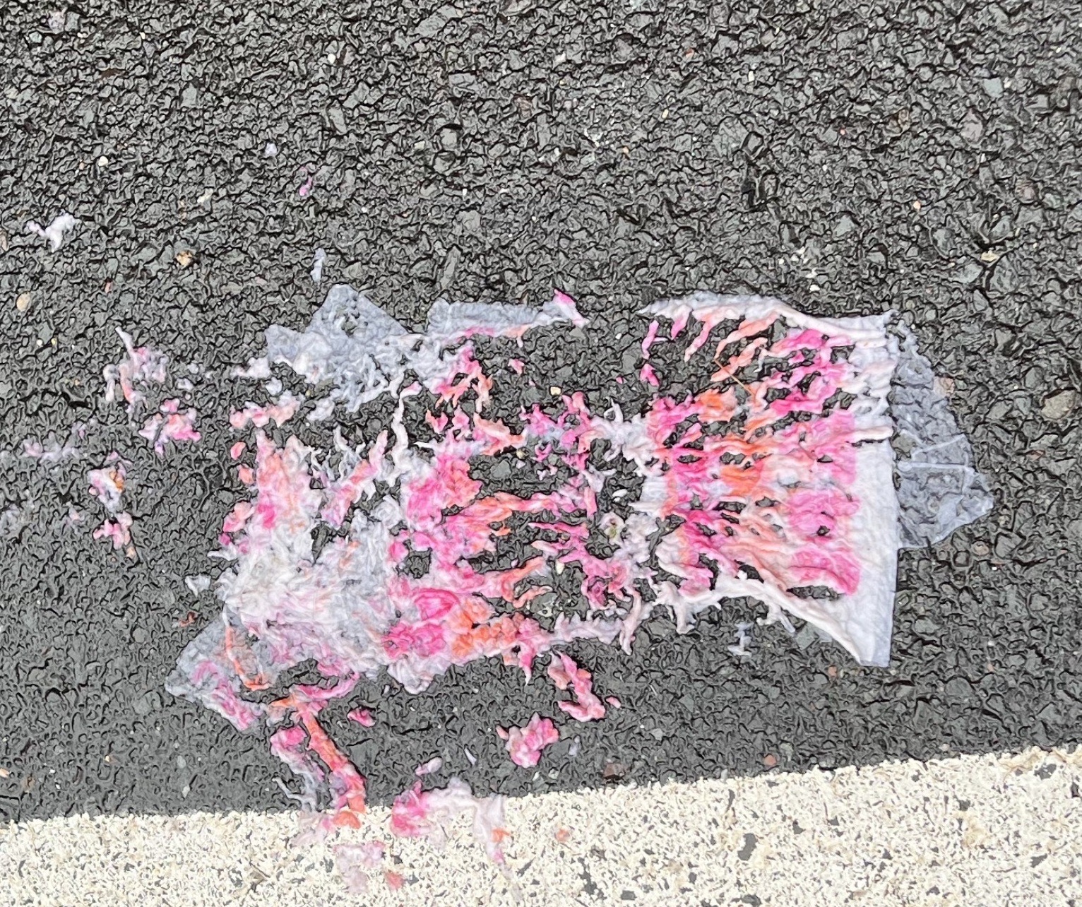
Do you recognize this brand?
Take a minute to think. You’ve likely passed by it or stopped in on your morning commute and no matter where you are, the iconic pink and orange are always the same. So…..do you know what it is?
Of course it’s Dunkin’®!
The Dunkin’® brand is so recognizable that whatever the situation, you know it’s Dunkin’®. Take this destroyed napkin for example. Without a doubt, just seeing the colors you can recognize that this was one of their products.
So let’s dive a little deeper into what makes this brand so recognizable. To do so, let’s look at the Design Consistency Checklist. Not sure what that means? Check out our blog!
“FROM COFFEE BEANS TO JELLY FILLING”
Analyzing The Brand Consistency of Dunkin’®
Brand Colors
The official colors of Dunkin’® are the bright orange and pink that everyone has grown to know and love. Remaining consistent from the 70s to today, the brand colors were thoughtfully chosen to be a quirky color combination reflecting the fun, positive, high spirits brand that it is. These colors represent playfulness, and also were chosen to increase appetite and draw customers into the stores. Their color palette has been utilized in all marketing collateral, which increased their brand awareness.
Brand Typography
Dunkin’® has continued to utilize a fun typography that is similar to Frankfurter and Debussy fonts. Their font was created to look fun, plump and even appetizing as it can be easily associated with the donuts that it so famously represents.
Brand Hierarchy
In January of 2019, Dunkin’® launched a brand refresh that primarily impacted their Brand Hierarchy. During the rebrand, the most notable shift was their name change. They went from Dunkin’ Donuts®, the brand name they had been using since 1950, to Dunkin’®. This change was deliberate, and effectively demonstrated their overall strategy shift. Their primary business focus switched from selling donuts, to being a premier beverage-led, on-the-go brand with a heavier emphasis on drinks.
Brand Grid
The brand grid is consistent throughout all of their collateral – keeping the brand’s aesthetic clean and fun. Dunkin’® does a great job of maintaining consistency in its various product lines, by establishing unity amongst all elements used throughout their advertisement and promotional materials.
Brand Recognition
What sets Dunkin’® apart from others? It’s simple, they’re consistent. That orange and pink color combination is known throughout the world, and is only associated with their brand. The plump bubbly font aligns with the brand’s fun aesthetic and with their famous donuts. Paired with catchy taglines, they have successfully been able to rise to higher levels of brand recognition over the years.
Because as we all know – America Runs On Dunkin’
You can learn more about brand consistency and other important branding tips in Ramon Peralta’s new book, Launch Your Brand. Available now on Amazon.

